Editing Aurora photos. Part 1

Guest post by Justin Nederkoorn,
travel photographer and videographer
In our previous article, we explored the nuances of photographing the Aurora — from gear selection to mastering camera settings, and more. If you haven't read it yet, we highly recommend checking it out before proceeding.
Now that you’ve captured a perfect Aurora photo let’s continue the process and learn some of the techniques to extract that magical feeling from your photos. I’ll walk you through a new Aurora shot that was taken during my most recent trip to Iceland which was taken at Landmannalaugar during blue hour. In Part 1, we'll cover essential adjustments and prepare the landscape and Aurora shots. In Part 2, we'll merge both shots, teaching you how to seamlessly combine your Aurora with a foreground, even if they were taken at different locations. Let's get started!
Workflow
For my edits, I utilize two key software tools: Adobe Lightroom and Adobe Photoshop. While various editing software can yield the desired results, it's essential to work in layer-based editing software that will allow you to manipulate an image well beyond the initial raw developments.
First, we start by selecting our foreground. If you’ve composed an Aurora with a foreground element, then you can use your long exposure that has the least amount of noise as your foreground shot. But for anyone who didn’t, you’ll have to find a different foreground to work with. Since the foreground almost completely defines the composition, we’ll be looking for an Aurora shot that matches the overall scene after selecting our foreground. We’ll then work on both images side by side to match the tones of the scene. And lastly, we’ll use Photoshop to merge them and to start working on our final piece.
Shot Selection
1. Selecting the foreground
When determining what foreground works best, there are a couple of important matters to keep in mind.
Realism is the key
The first, most obvious, is that we want to create something convincing. This means that the final piece should be something that could actually happen, something that is realistic. Therefore we want to only work with foregrounds in locations where Aurora can be seen such as northern Scandinavia, Iceland, Greenland, or Canada. This might seem straightforward, but it’s a foundational principle.
Matching field of view
Ensure the field of view for the landscape aligns with the Aurora. Using different focal lengths between the sky and the foreground can create a distracting effect. Try to closely match the focal lengths to enhance realism. It doesn’t need to be perfect, but the closer the better.
Tonal harmony
Colors and tones set the mood of an image. To make sure these flow together nicely, consider the time of day you’ve shot the foreground. A blue hour shot will naturally work better than a daytime shot, as it matches the tones of something that was shot later at night. Besides, Aurora can also appear at blue hour, making the final result more convincing. Matching tones between the foreground and Aurora enhances the overall credibility of the final image.
The narrative of shadows
Shadows are one of the biggest giveaways if something was shot at night or during the day. Night shots typically feature soft shadows, so avoid using a foreground with harsh shadows. Again, a blue hour shot matches the shadows of something that was shot at night, making for a good foreground. Of course, a moonlit landscape can have harder shadows, but even then the length and angle of the shadows could give away if it was indeed moonlit or sunlit.
Weather conditions
Even if you have a perfect blue hour shot but it was completely overcast, you’ll have a hard time blending the two together. For seamless blending and a smoother workflow, clear skies in your shot are ideal. Overcast conditions can complicate the process, but a clear distinction between the landscape and clouds may be workable. Beware of mist or haze, which can hinder blending.
Keeping these rules in mind, I landed on a foreground that I shot during the blue hour in Landmannalaugar. As you can see, the shadows are soft and the sun has dropped well below the horizon. The skies were pretty much clear apart from a cloud on the right. And this foreground was a 24mm vertical panorama, exactly matching the focal length at which I shoot Aurora.

2. Selecting the Aurora
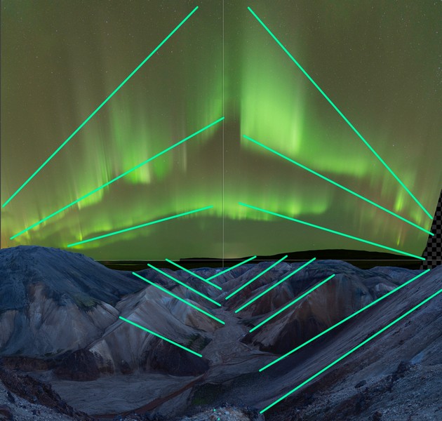
The driving force of what Aurora shot you use in your piece should always be composition. We want to make sure that the lines of our Aurora shot complement the composition of our foreground. I’ve drawn over some of the most dominant leading lines in our landscape so we can start identifying possible candidates. Ideally, I’d like to work with something that either follows these lines or complements them by leading outward.

Another important factor to consider is that the foreground was shot as a panorama. Therefore we should prioritize using a panorama Aurora as well to adhere to our rule of matching the focal lengths and perspective. After doing a couple of rough sketches, I found an Aurora shot that would play nicely with our foreground. The outward leading lines complement the existing leading lines and create a diamond-like shape.
The Edit
While the landscape is the most dominant part of our composition and thus roughly dictates what Aurora shot we pick, the opposite rings true when it comes to actually working on the edit. We start off by editing our Aurora, as that is what will be drawing the most attention, so we want to get it exactly right. The tones of our Aurora are the most dominant and will determine what kind of tones we want to see in our foreground, as well as indicate how bright or dim they should be.
Even though I’m working on a panorama, the process for working on a single image is exactly the same. Before I stitch my panorama, I’ll first edit the shots separately and then stitch them using PTGUI. Whichever shot has the most luminance and color is the one I’ll be working on. Reason being, when I copy the adjustment to other images that will be included in the panorama, I can be almost sure there will be no blown out highlights or weird banding effects due to newly introduced colors.
This is the raw image I chose to work on. It might be hard to see right now, but this is the one that has the most luminance and color range, so it’s the perfect shot to edit. After walking through the rest of the shots, I noticed on the histogram that those are less bright and contain less color. You may need to increase the exposure on your shots slightly to be able to tell. If you do, make sure that the increments are exactly the same across all shots.

Aurora
Immediately, I see that my white balance is set to my daytime value (5600K) as the Aurora caught me by surprise. This makes the Aurora appear very green with almost yellowish tones. I prefer to work with a color range where the greens appear colder, almost starting to shift to aqua. I need to adjust my white balance to around 3000K to transition from warm to cold greens, and then play around until I find a balance that’s natural but also matches my artistic vision. Beware that white balance adjustments are preferable to modifying the green hue in HSL to maintain smooth color gradients and avoid banding.
I’m also going to raise the exposure significantly so we can get an idea of our dynamic range. I’m dropping the whites slightly to prevent the highlights from blowing out and increasing the dehaze value to help define patterns more clearly. At the same time, I also increase my contrast and clarity to further extract color and structure from the raw. A trick I often use is dropping the vibrance and increasing the saturation. This usually gives me nicer transitions between colors to work with and I prefer this balance of tones.

To improve contrast, I create an S-Curve in the Tone Curve panel while being cautious not to push the shadows too much. This would make for an unnatural look and increase saturation severely. An S-Curve may lead to blown-out highlights as I intensify the highlights and whites. To fix this, I go into my RGB channels and drag down the white point until it has some room to breathe on the histogram. Working on an image is all about molding it, and finding balance between the adjustments you make. So don’t be afraid to sometimes push an effect you like to then go back into other panels to clean up any negative effects it introduced.

After this, I make very minor changes using the HSL panel to the blue color. This helps me to nail it in the spectrum I’m looking for. I shift the hue +5 towards purple, desaturate it with -15 and decrease its luminance by -10. Then I run the built-in Lightroom denoiser to clean up any introduced noise and copy the adjustments to my four other shots that will make up the panorama. Since we only need to reference the tones and color of the Aurora, I’m roughly positioning them together so we can use that while working on our landscape.

Landscape
Now that we have a general idea of where the tones, colors and exposure are sitting, we can start bringing our landscape closer to our Aurora. First, match the temperature, so the shot cools down until it’s closing in on the tones of the Aurora. We also want to increase our dynamic range to have more room to work with. This slightly flattens our shot, but we’ll fix the contrast using the tone curve a bit later. To get ready and reveal more shadows I lower my highlights and increase the whites while also increasing the blacks. To add back in some depth, I slightly lower my shadows. A very minor increase in dehaze extracts a wider range of tones from the mountains, which I then manipulate using the same vibrance / saturation trick.

The tone curve is one of my most important tools when working on luminosity and contrast. It allows me to precisely shape where I want contrast, and how heavily I want to apply it. I increase the mid tones and highlights so that the peaks and colors of the mountains stand out better while also pushing my shadows a bit. Note that I don’t push the highlights as much, giving more contrast in the midtones as opposed to the highlights. This enhances the perception that the shot was taken at night.

Now that our contrast is looking good, we can start working on colors. To get the colors of our landscape to closely match the Aurora, we’ll have to manipulate it carefully. My favorite tool to do this is the Calibration panel. Rocking the sliders back and forth can give you very drastic results, reinterpreting how Lightroom processes red, green and blue. I recommend you play around with them until you strike a balance that feels right. You can check out what values I use below, which gets our image pretty close to the ballpark color I’m aiming for. I then use the HSL tool to correct the oversaturation of blue, as well as decrease its luminance to make the highlights roll off smoother. In the color grading panel I add a hint of cyan to the highlights to mimic the color cast of the Aurora on the mountains. And to make the blacks truly black, I’m adding a bit of orange to the shadows.
Achieving pure blacks is important to prevent your image from having a washed-out feeling. Use your histogram to monitor your blacks and watch the RGB channels closely. While working on the shadow color grade you should be able to identify a point where the RGB channels exactly overlap in their black points.

Right now I feel like both our landscape and Aurora are now ready for the final development. Remember that the goal of this step isn’t to exactly match the color and exposure of the Aurora. It’s to get it in the ballpark and then do our refinements in Photoshop, which allows for more precise manipulation.
Closing words
While we’ve covered important topics today such as being deliberate with your shot selection and working on the initial raw developments, the real magic begins when we start compositing both images into one piece.
In our next part, we'll dive into the exciting process of seamlessly blending your images in Photoshop. We'll explore the techniques that transform your work into a harmonious piece. Stay tuned for Part 2, where I'll guide you through these challenging yet rewarding steps, giving you the tools to shape your image to match your artistic vision.